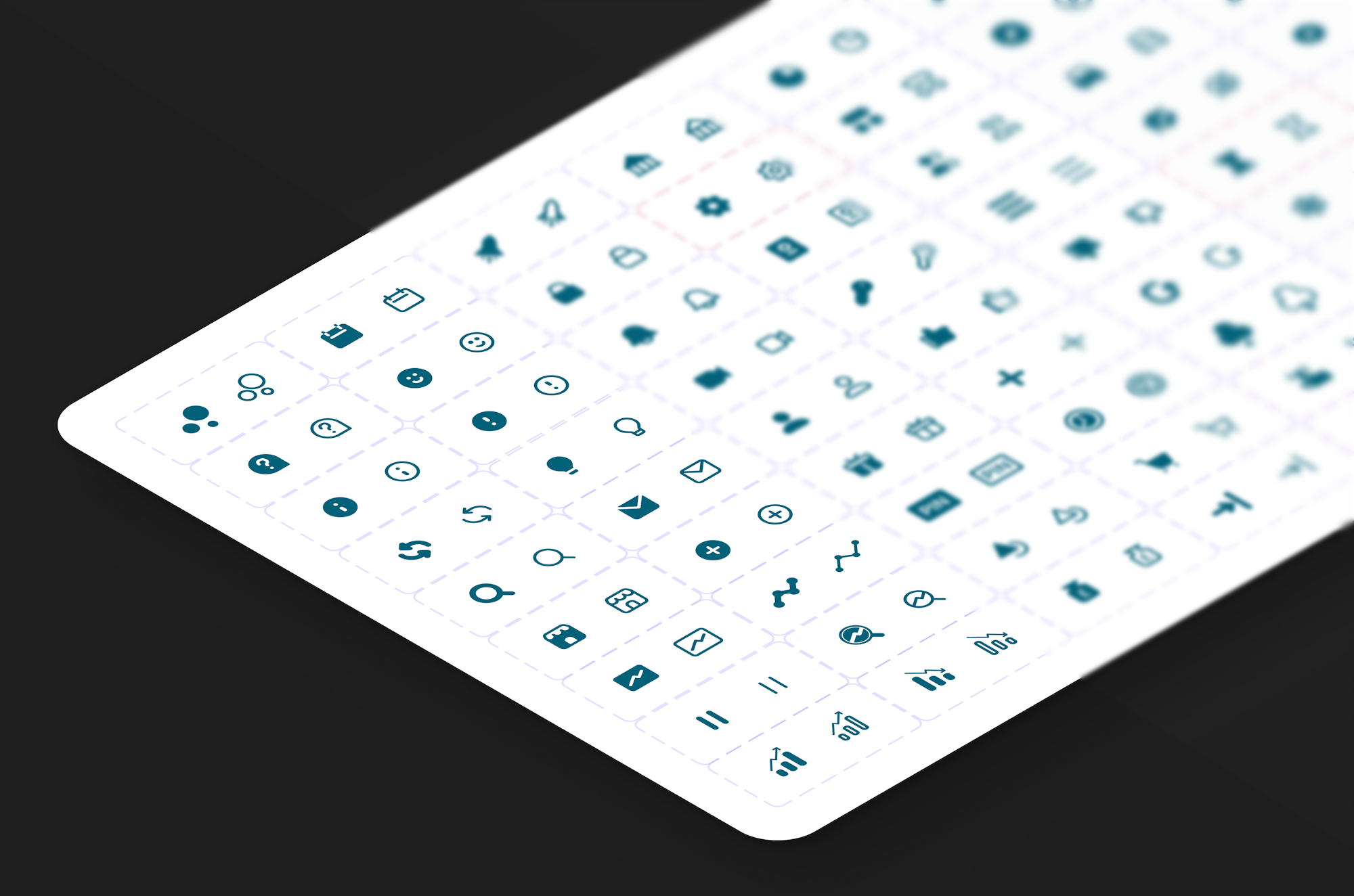
MoneyboxIcons
Summary
When I joined Moneybox, we decided to undertake several tasks simultaneously. The primary objective was to revamp our design system nestbox, and we also wanted to rethink our icons in conjunction with this.
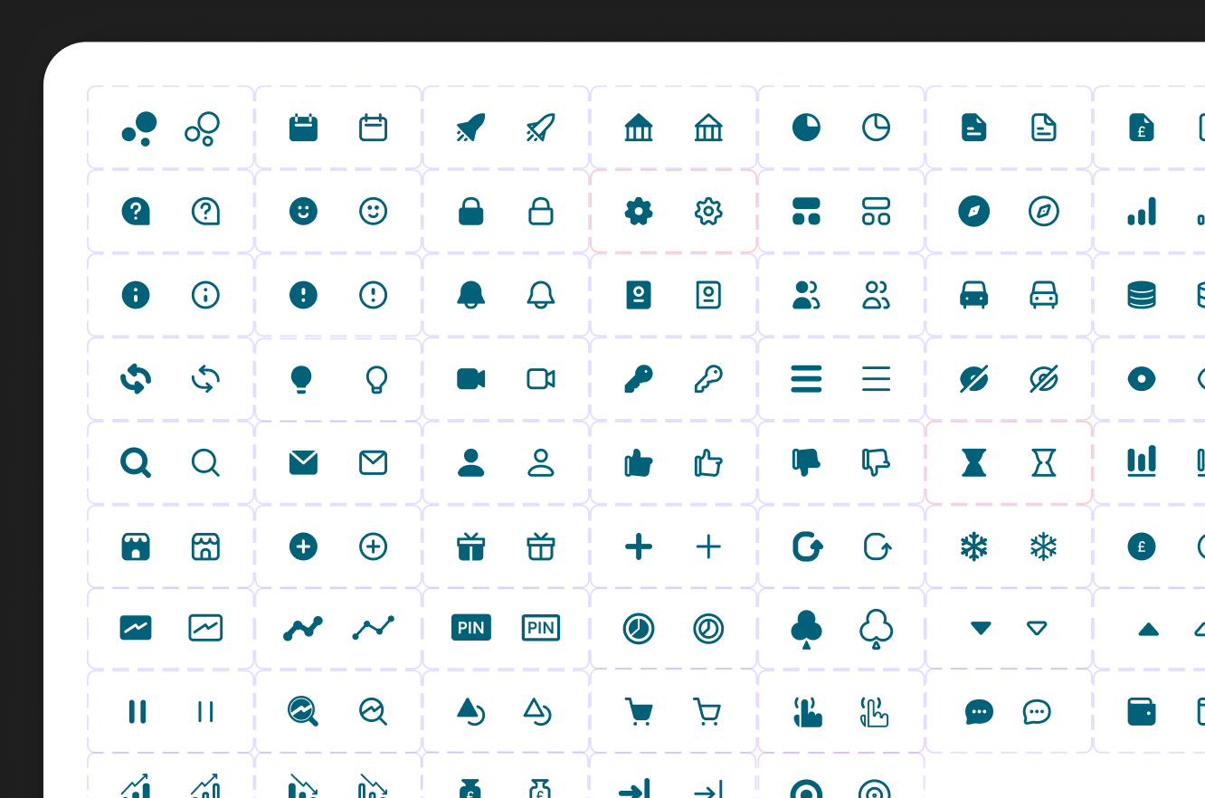
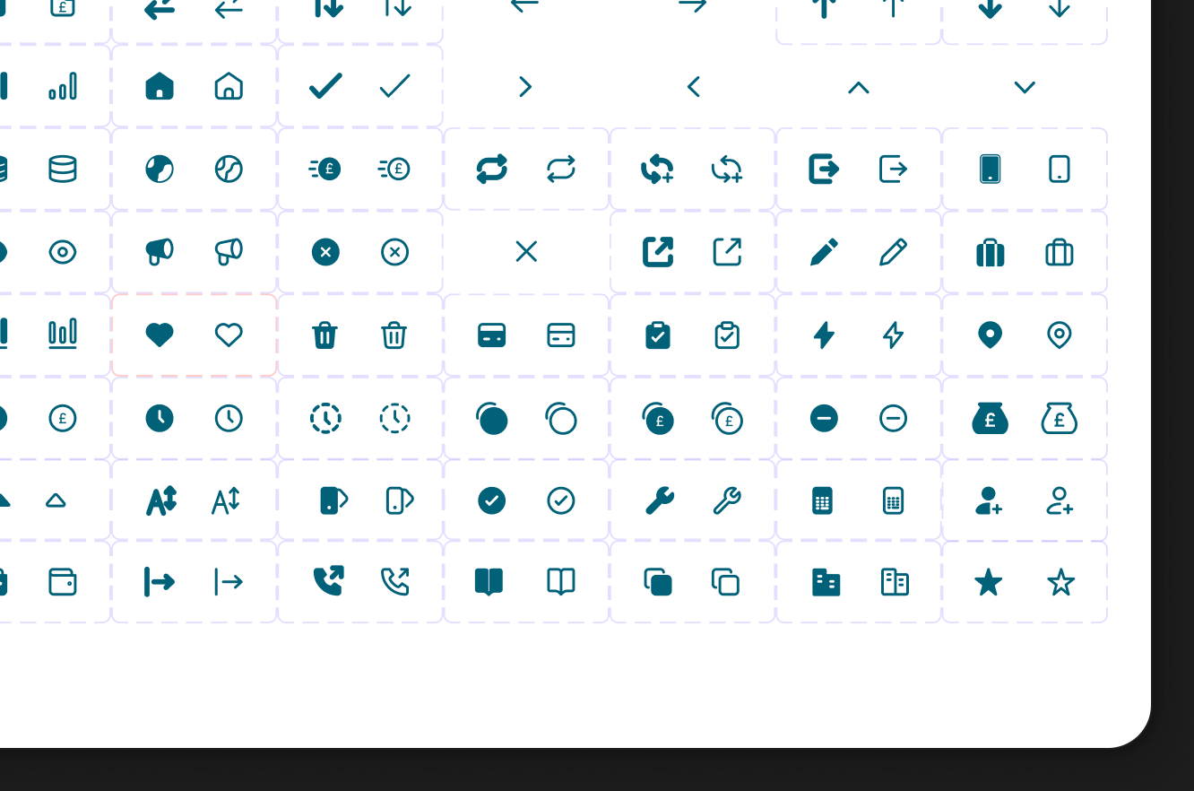
During the process of compiling nestbox, we noticed that our icons were highly inconsistent and required a significant reevaluation to align with the modernisation we were implementing for the main app interface. As we refined and simplified various elements, including reducing line weight everywhere, we realised that our icons needed to reflect this new aesthetic.
At that time, I had been using various icon sets in my freelance projects and stumbled upon Iconic during my search. I collaborated with James to create a basic Figma plugin for Iconic (although it never materialised). Consequently, I gained lifetime access to the entire set for free. Their license is quite permissive, allowing us to use the icons as we please, as they already embodied the general feel we were seeking.


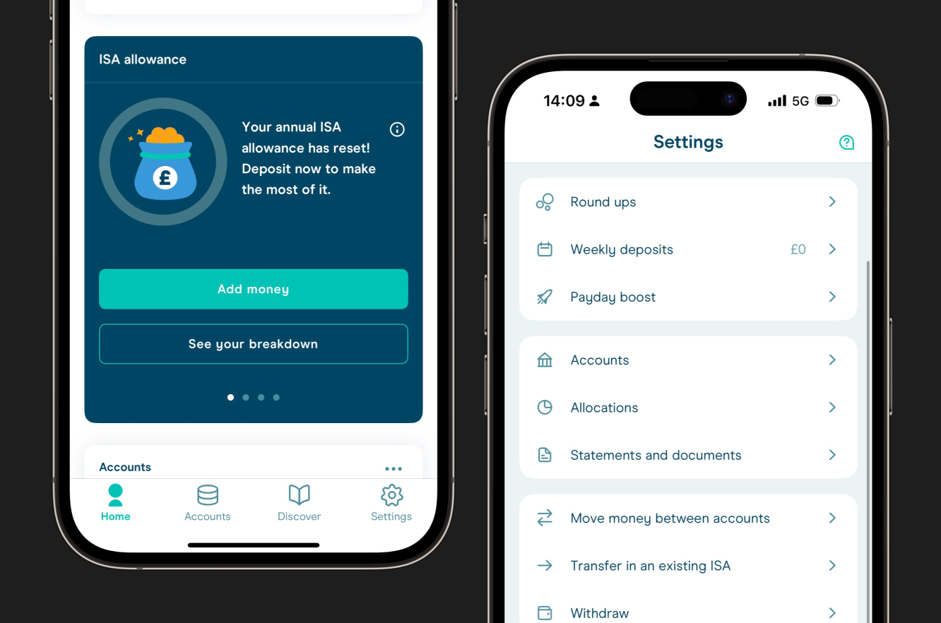
Due to their 1.5px stroke weight and softer radii, we decided to switch from filled icons—whose contrast demanded too much attention in this context—to our new stroke-only variants to better balance the UI.
This decision also benefited places like our TabBar, allowing us to have filled states for the active tab instead of relying solely on a color change (as previously done). This resulted in increased legibility and accessibility.
