nestbox
nestbox is the internal Moneybox Design System. nestbox started as a simple UI Kit used only by Designers inside Sketch initially.
When we transitioned to Figma (more on this below), we made the decision to take nestbox to the next level and create a true cross-functional design system.
Summary
When I first started at Moneybox we had an existing UI Kit (which we called a Design System) built in Sketch. Despite being well maintained, it wasn't wholly adaptable and also didn't provide any guidelines for us.
Most designers would build screens from scratch every time and would only reuse the odd atomic-level component to save a smidge of time.
Having built a more robust design system in my roles at Cosmic, HomeHero, and NeuerEnergy, I felt it best to build something more powerful at Moneybox.
We started with foundational pieces, which tied in nicely with my desire to switch us to Figma. Once I had internal buy in for the switch, we moved over in 2 months total (from first conversation to full switch) and chose to bring across legacy files (including the design system) but treat them as an archive or historic record.
Once shifted, we defined a plan of action for the design system (at this point, yet to be named). This consisted of the following:
- What are our atomic elements that are required?
- What molecules need to be built from these?
- How can we build more complex components from these, including page templates?
- How do we want to split the DS up and organise it?
- Can we take advantage of this idea of design tokens alongside this shift?
- Can we build a more flexible, future proof and robust system?
- Can we align engineering with us and all build this system together?
Once we had answer to all of these questions, I recruited an internal team of designers and engineers to concoct a plan and start building out the new system.
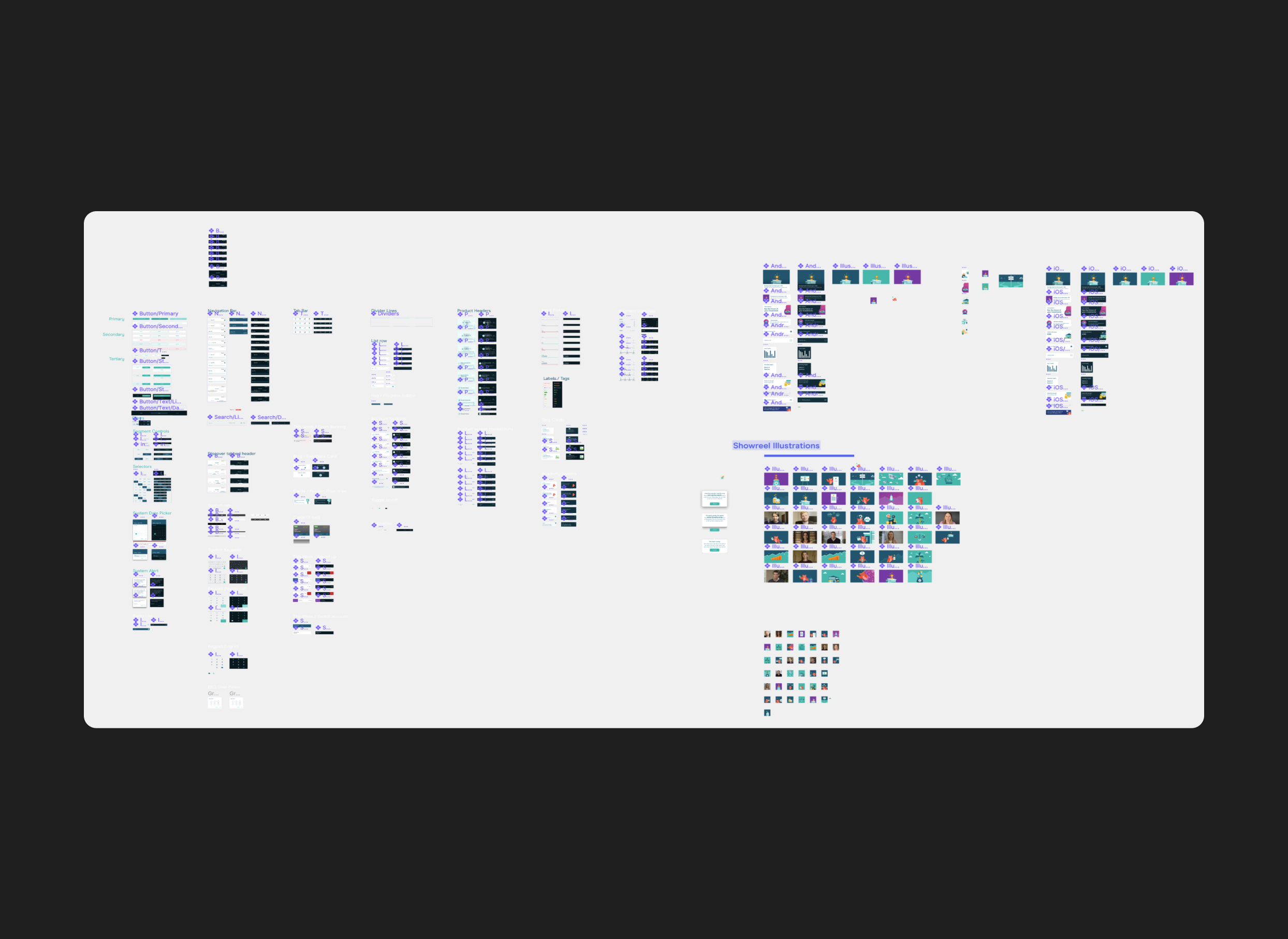
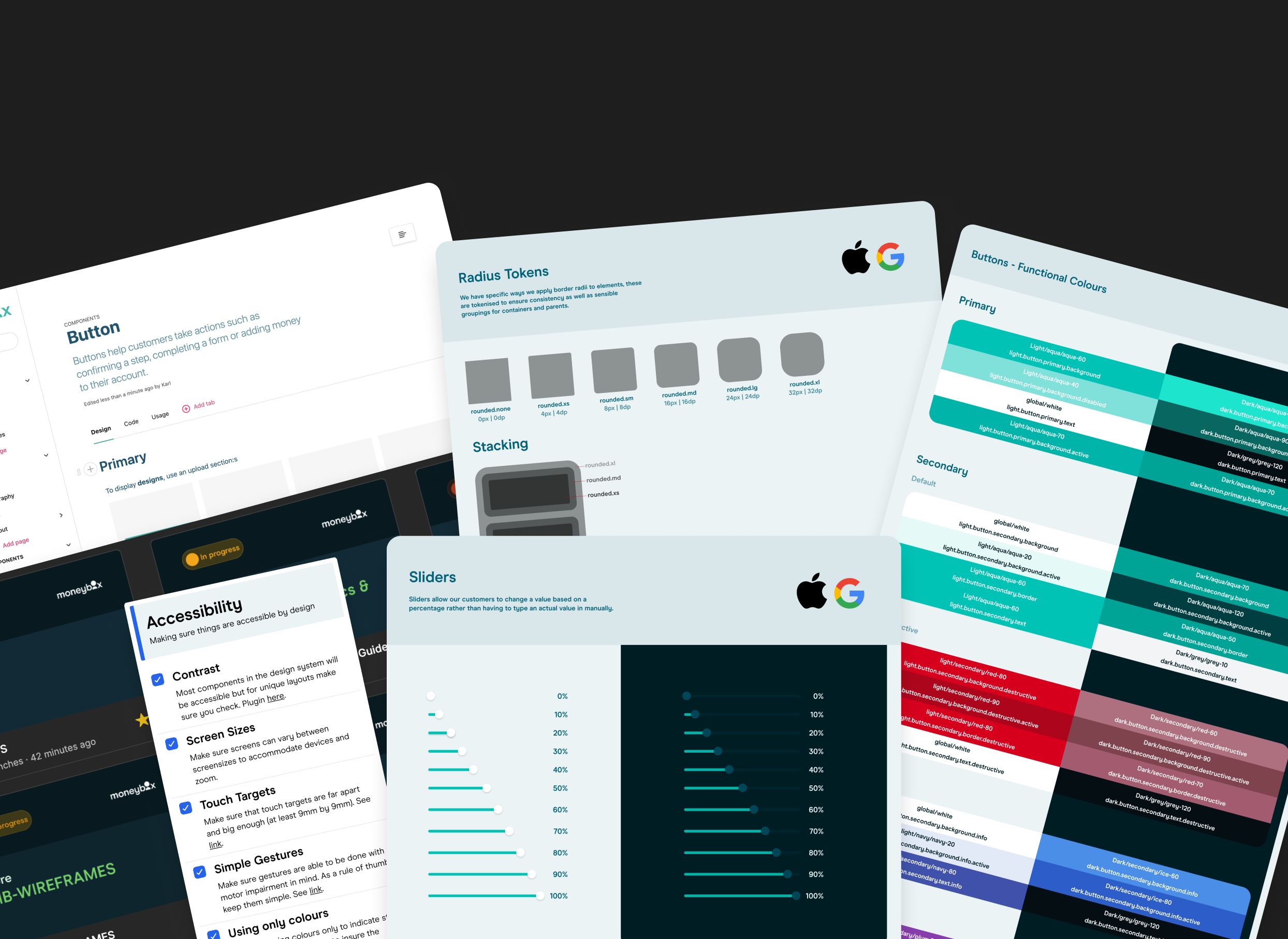
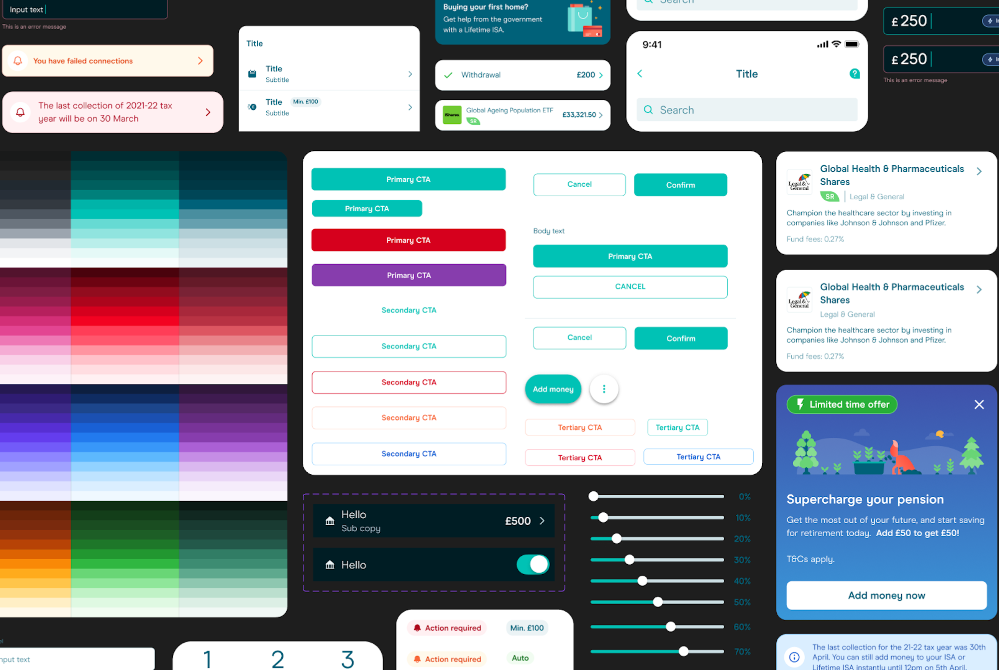
We agreed that the best path forwards was to start by defining a base UI Kit in Figma that mirrored closely what we had in Sketch but was built from the group up to take advantage of auto layout, variants and then component properties (when later announced).
Once the system was built and in use by design, we had weekly catch ups with our engineering counterparts to build out these as true component in Jetpack Compose (Android) and Swift UIKit (iOS). Using my combined knowledge of design and engineering, our components were already built with properties in mind, thinking carefully about adaptability and data variance, but we still worked closely to refine and better map these properties to the built versions without impacting on design team skill or knowledge (we knew that if they were too complex, no-one would be able to use them).
We've now been working with our new system for the past 11 months or so and have seen a fundamental shift in how our teams operate, the speed at which they can ship designs, and the level of pressure that's relieved when engineering come to build. We've got a long way to go still in reaching parity across teams, but already story points for builds are coming down and reliability of the built screen is going up.
Finally, with the introduction of design tokens across the product org, we've seen a shift away from having to design every dark mode screen. Because we use implicit tokens (powered by a separate Spectrum colour library), we can be confident that light/background/primary will look perfect on dark because we have a mirrored dark/background/primary token too. This gives both designer and developer confidence when shipping.
Using tokens, we bake in accessibility in by default too so designers only have to run checks against their designs if they deviate from our component library.