4.0
Moneybox 4.0 (MB4) is the next major rethinking and evolution of the Moneybox app experience. MB4 was birthed from the insight that customer savings are often driven-by and tied to personal goals; from purchasing their first home, to saving for a rainy day.
Summary
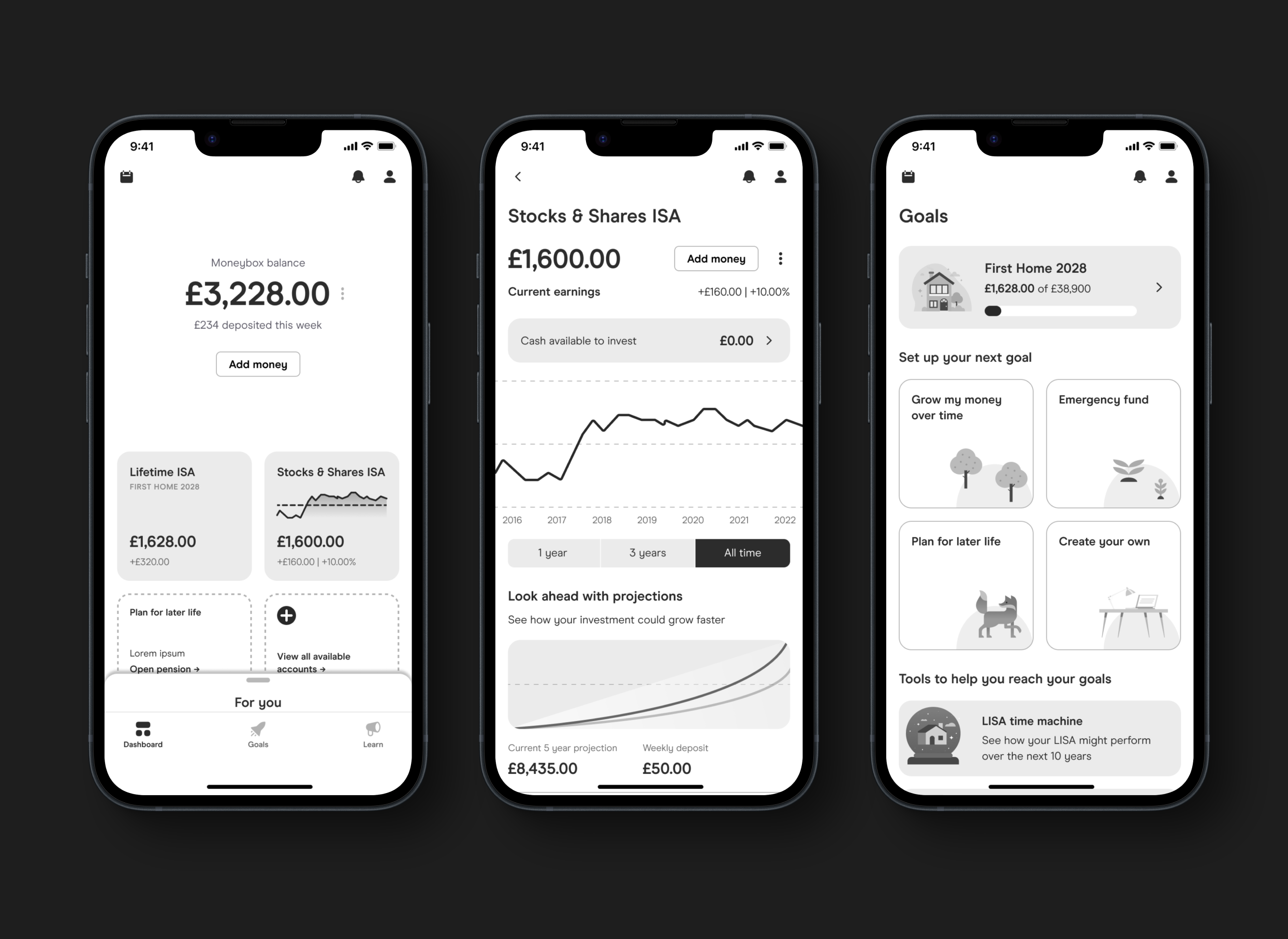
Currently, Moneybox is very account-driven, encouraging customers to open a particular account and save into that whilst slowly expanding to add more and more accounts through optional cross-sells, enabling them to build up a larger and larger pot of savings.
We began with the hypothesis that providing a layer of financial guidance (not advice) would help inform customers on their next best actions to take, including what types of accounts could be right for them based on their life goals.
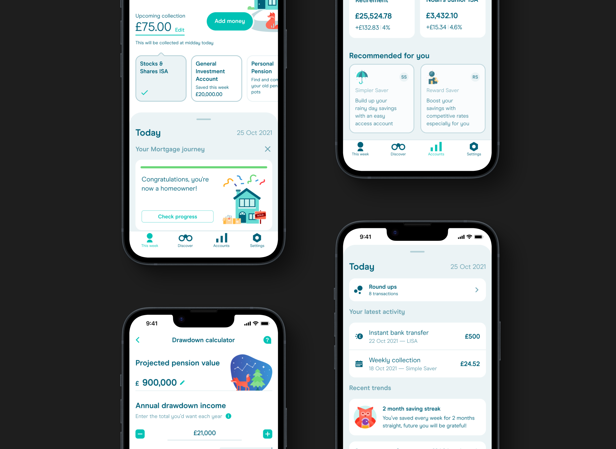
In order to get key Steering Committee (SteerCo) buy-in, our Head of Design needed some hi-fi design concepts to get that start of the new rethinking bought in to. Initially we began by exploring how we keep the core product the same, but start to introduce some of the concepts of a more intelligent and guiding product. We did this by slotting insight and trends into the bottom interface drawer on the main This Week (home) tab. We then also explored adding in recommended accounts based on which accounts the customer had open already and what the next logical account is for them. We then tailored the look and feel of those to be anchored around the goal they could be used for rather than what they actually are.
Once we got the buy-in to explore the project further, we worked to establish some core competitor research across multi-national companies. In the UK, no other fintech app was expertly delivering on financial guidance, mostly they were scratching the surface. In the US and Canada, however, there was some great examples of what could be done. Moneybox is a UK-only product currently, so we had a great opportunity to own this part of the market.
The early IFA research also taught us a lot, we learned that these platforms were inherently inaccessible for the non-Rich, or at least felt as though they were. Here again we saw a huge opportunity to own this space and provide guidance to customers in an accessible and viable way to take them towards their best financial outcomes.
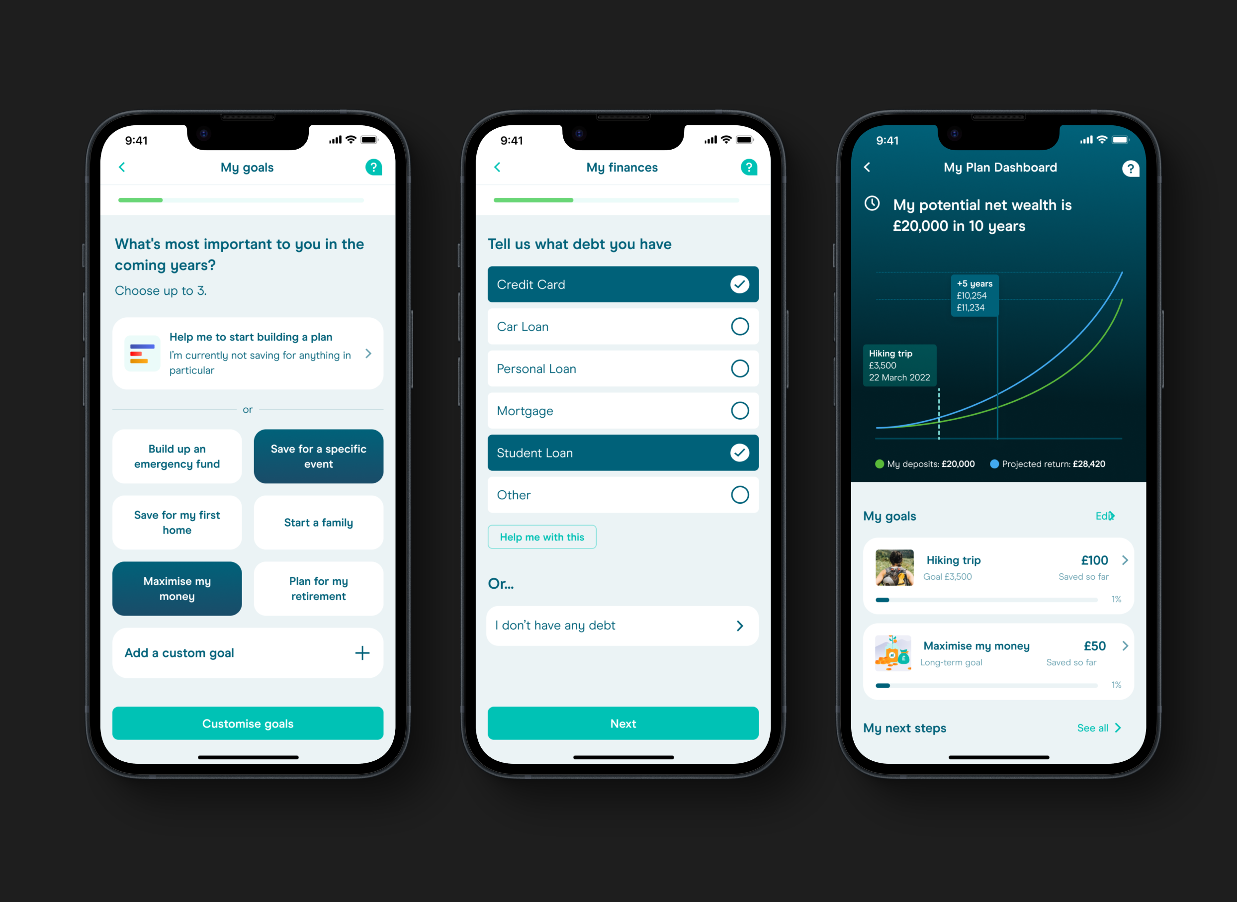
Following the outcomes of this research, we worked through a series of lo and hi-fi prototypes to build out a more realistic presentation of what this (then called) Planning feature could look like in the app. At this point, we'd still not made the decision to shift the entire product experience, but instead bolt-on this feature.
The further we explored the project, the more we realised that the only way to efficiently ship guidance to customers was to completely rethink the product architecture and experience. This led us down the path of rethinking the entire product and working through many different prototypes and experiences. These ideas were validated using moderated and unmoderated usability testing with both customers and non-customers.
Below is an example of one of the most recent prototypes that we've used to sell the experience to SteerCo and to get us to a point of building out the story points with engineers to agree the viability of the final build.