Screw it, I’m also making a typeface
Prologue
I recently undertook Elliot Jay Stocks’ typography course via Smashing Magazine and fell properly into the world of type and fonts.
At that same time, I was watching PJ Onori and his Screw It, I’m Making a Typeface series.
As a result, I couldn’t help myself. So here it is, my somewhat plagerised/borrowed series about making my own typeface.
Initial Preparations
So firstly, Elliot and I have been chatting a fair bit recently about reviving an old project of his (exciting!) and he recommended the Font Making Course by Viktor Baltus and it’s brilliant. So far I’ve gone from zero font making knowledge to having the bones of a typeface with its own personality in a couple of days. Mental.
We use Glyphs 3 to do all of our font making, and its got a few quirks in terms of design and UX (sorry, can’t help myself, but type designers aren’t software designers and it shows). But overall it’s great software that makes crafting type far more straightforward than my preconceived ideas were going in.
I mean, just look at the mess that is this menu...
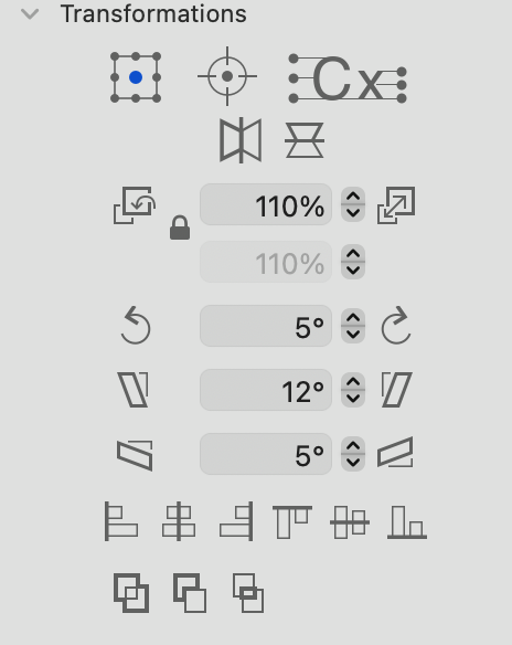
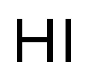
With Viktor’s course and Glyphs 3, it was wildly easy to get started and begin with creating my first glyphs. Even just getting that first H ready was an amazing feeling.
First Attempts
In all honesty, I was extremely suprised at how well my first attempts came out.
I got to HI pretty quickly…
And just a few days later I had a full alphabet, with numbers and diacritics.
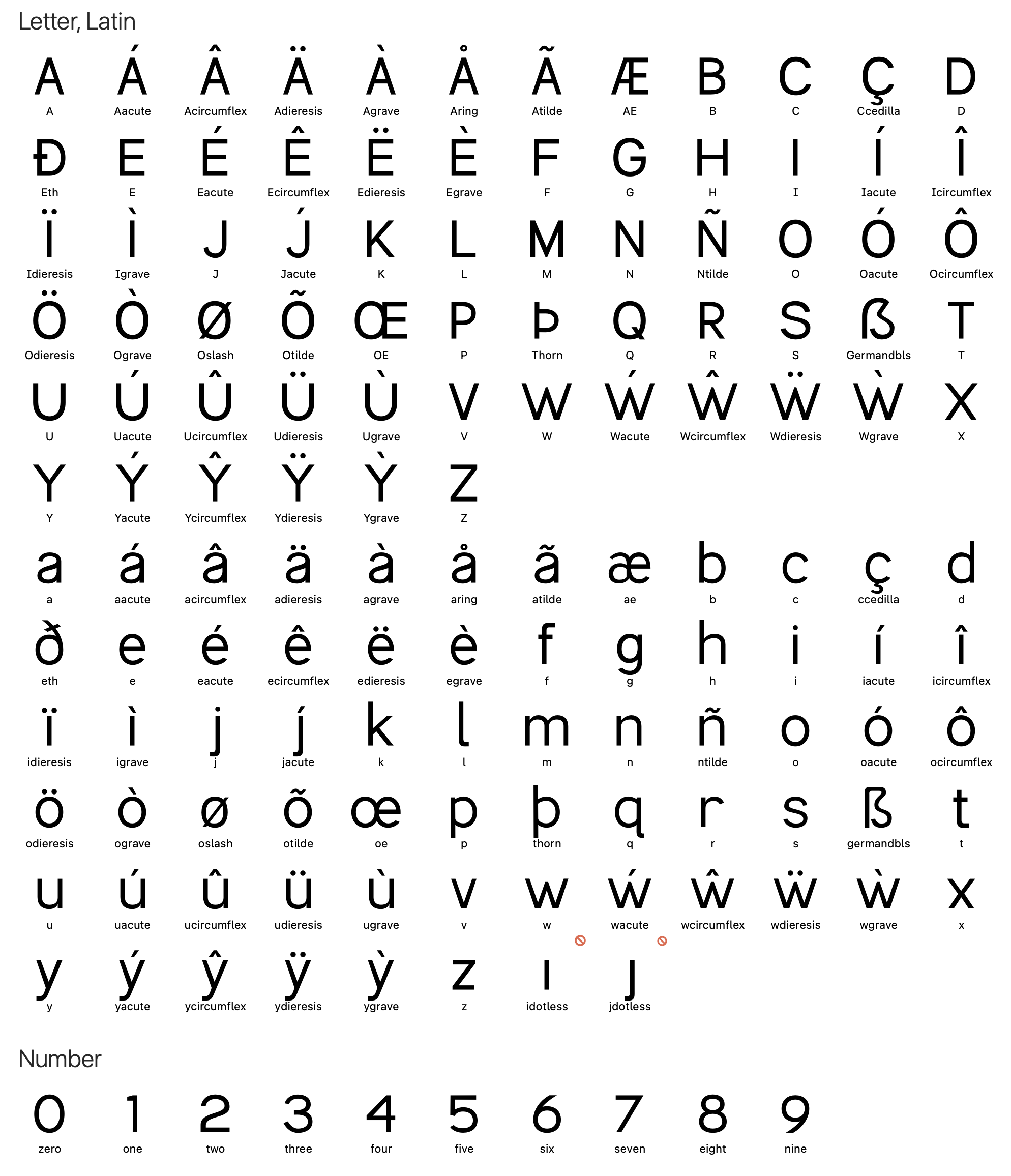
I wasn’t done of course, but it was something that felt real. Note the absence of kerning pairs at this point too. But that comes later!
Progress Updates
Just like PJ’s blog article, this will be a regularly updated article on specific aspects of the project, focusing on both successes and challenges.
As more things happen, I’ll share. But I’m excited.
Since first scratching out the initial post to kick this off I’ve already made some adjustments and improvements to my u, a and t characters, ensuring that they sit better as part of the entire set. Note, kerning pairs still don't exist, but you can see compared to the above that the a shape better matches the set, the u feels the right width (slightly narrower) and the t ascender height is a better height.
Interestingly, to get the lowercase a right I had to take a different approach. Initially I started with a c and an o and used those two to try and pair up and shape a nice looking a but the more I looked at it, the more I realised the problem with how it looked was due to the lack of curvature between stem and bowl. So to solve this I actually turned to my s, flipped it horizontally and then added a dotless i to create the stem. And with lots of micro adjustments to the exact curvatures and placement of nodes, I got to the below. Feels a lot nicer.
And as I uploaded this I spotted that if I was going to adjust the u I needed to make the same change to the n to match. It’s super subtle, but they both felt just a little too wide compared to the other letterforms.
I thought there’d be more of a science to it, but man is making type a tonne of optical trickery and adjustment. Fun though!
Spacing and Kerning
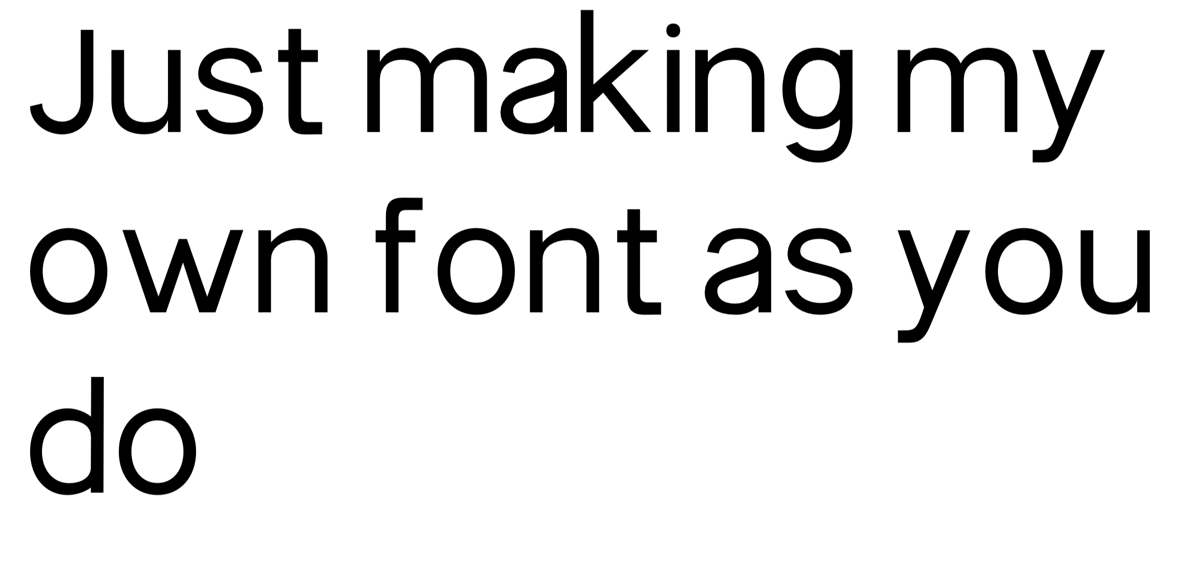
So now I’ve made a first jump at spacing. This doesn’t include pairing-specific kerning but even just basic good spacing following the rules of OHNO gets you most of the way there.
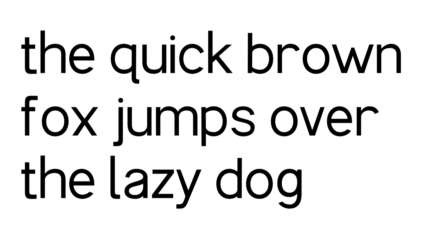
Notice that the f and o look a million miles away, but the rest looks pretty close to ready.
On to kerning pairs next!
Note: I’m really enjoying the decisions I made at the beginning to go for a high x height on the font, it adds a nice quality to the type alongside the quirky finials of the q, f and t.
Because I had the audacity to suggest the importance of kerning pairs when I spied some quirks with PJ’s walked wording, I had to obviously make sure my kerning looked right for mine! Some basic kerning pairs done.
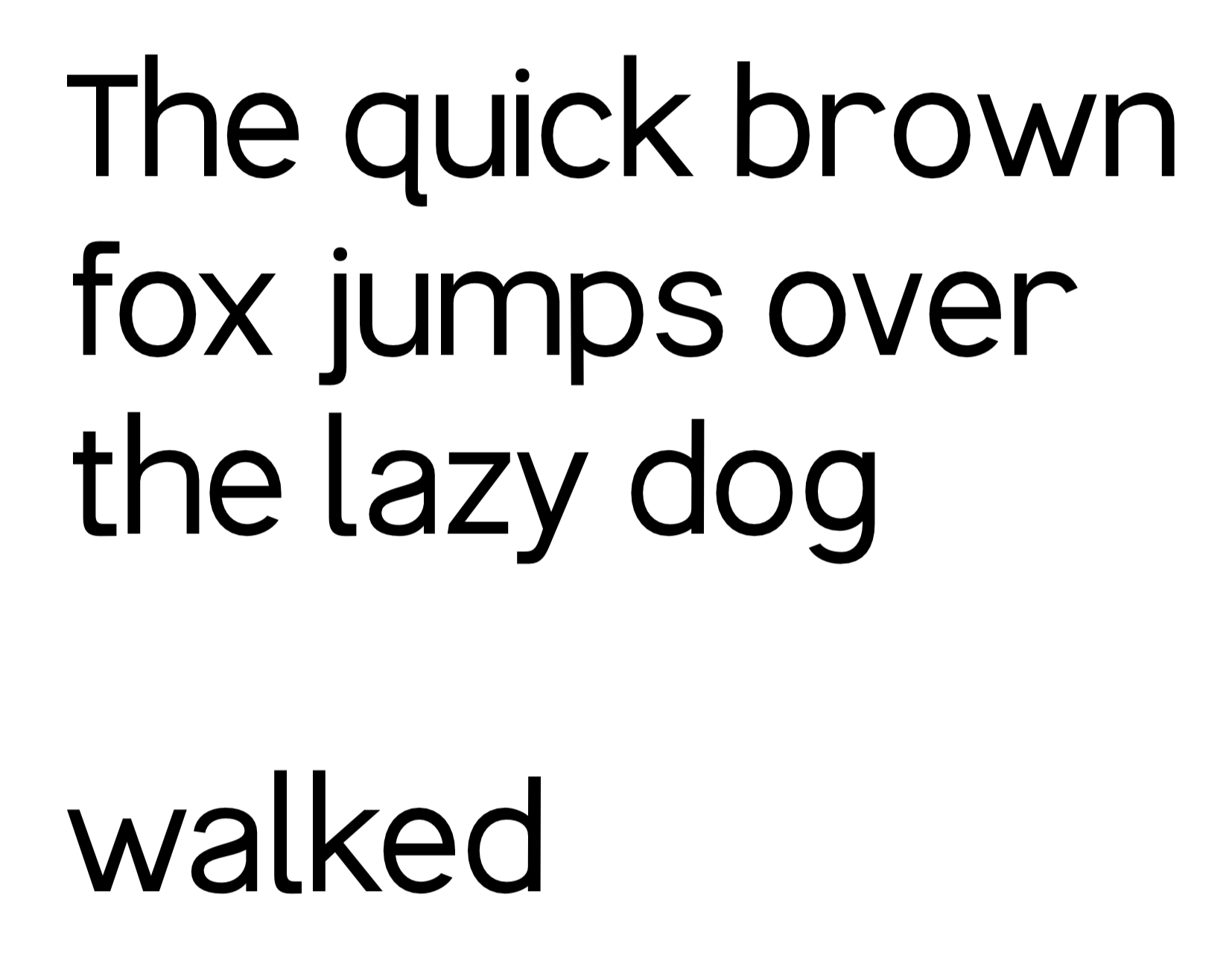
Notice that the f and o from above are neatly tucked together now, and the word walked looks nice and balanced.
Installing and testing
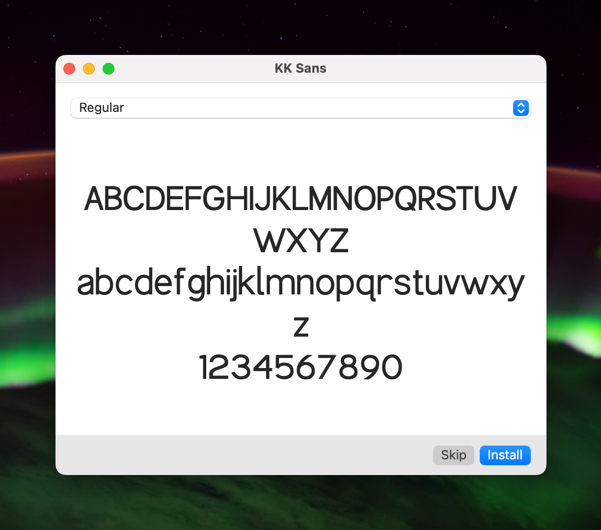
Now that I’ve done a first pass, I can actually export and then install my font to test it out on some things. I’ve only got a regular weight for now, but it’s something! This feels bizarre to me for some reason, but I love it.

Testing inside Figma
In order to get away from the Glyphs 3 editor environment and try things out in a tool I use daily, I thought I’d open up a trusty old Figma file…
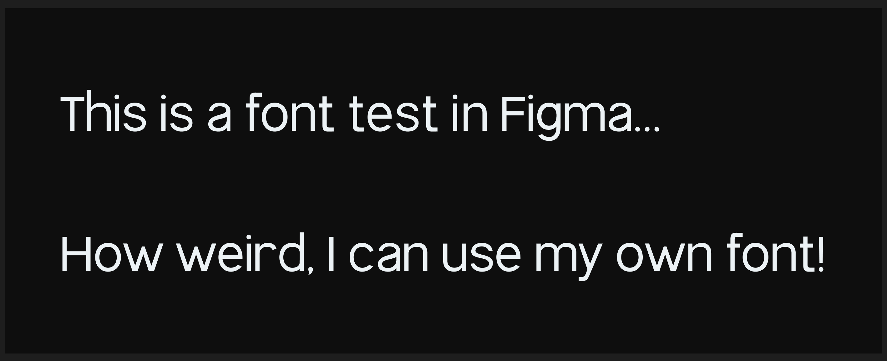
You can see here that my high x height is nice but I’ve set my ascenders too high compared to my cap height so they poke up too much. That’s next on the fix list!
I’ve got bold working now too. So once I fix these heights, I’ll be playing around with that and then exploring variable fonts and auto-generated weights.
Fine tuning
Once I could write proper sentences and see things in a more normal context, I could better figure out some of the weirdness that felt off.
To remedy the main problem, I dropped the global ascender height by about 40% which meant that they still poke over the capitals (I like that vibe) but not so much that they feel disconnected or become distracting.
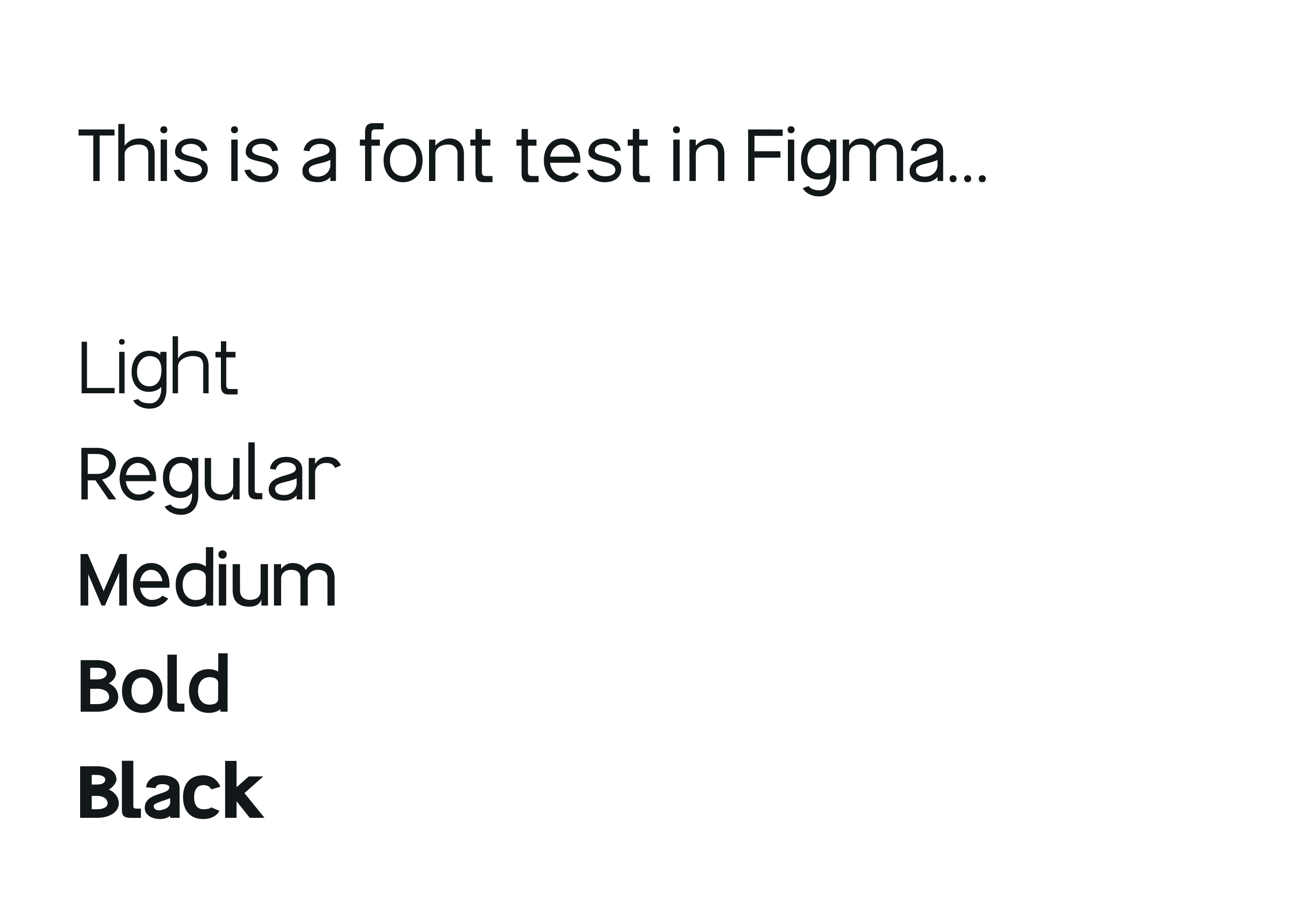
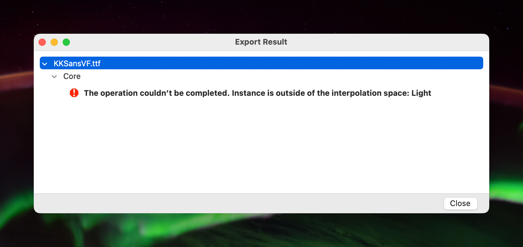
I also auto-generated light, medium and black weights to give me more variety (cool!) but I can’t seem to export these auto-generated ones as a combined variable font. If anyone knows why this error is showing up, please let me know in the comments!
Dog-fooding
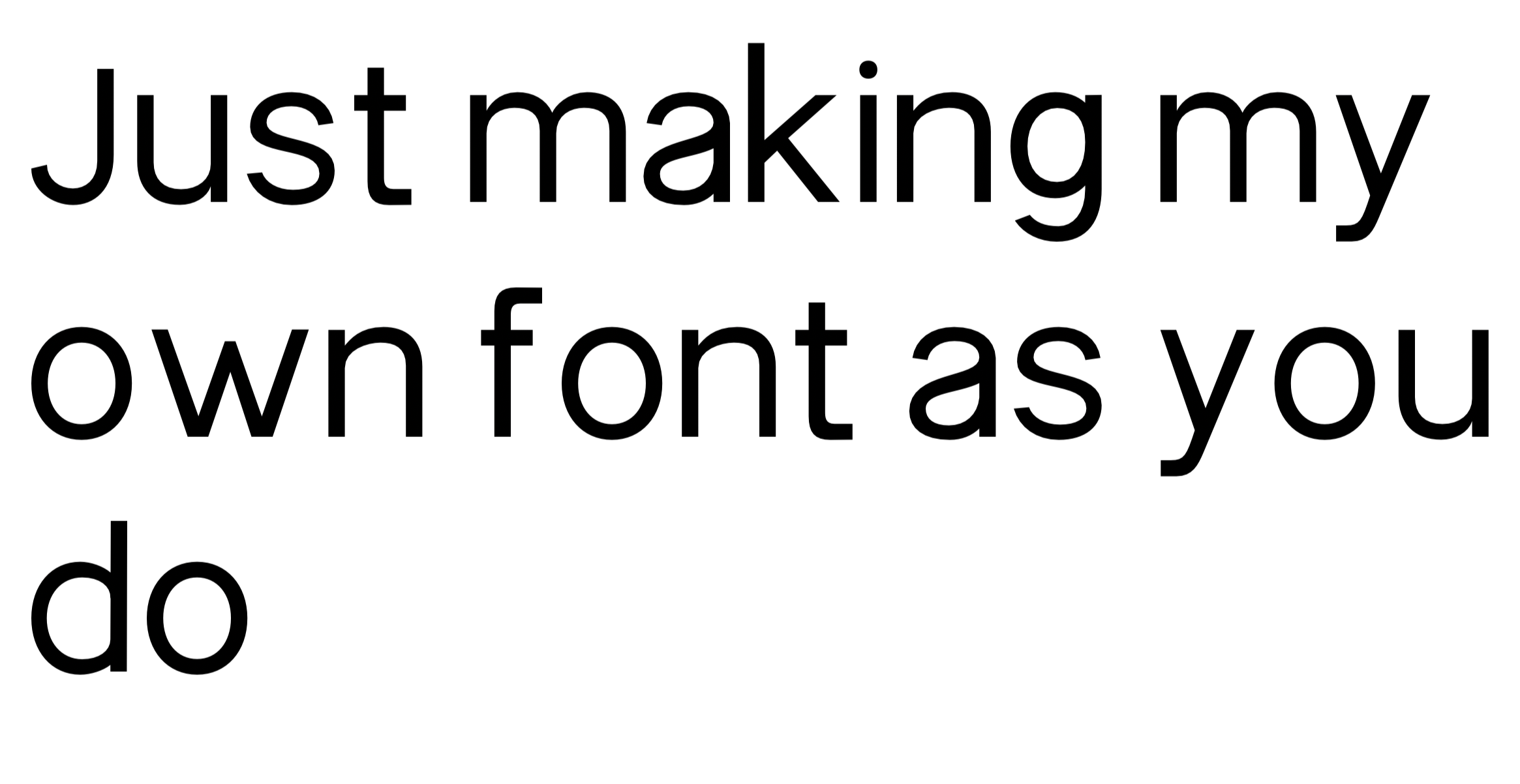
Well… if you can’t use it on your personal site, what can you use it on? So now, the sans on this site is replaced with KK Sans (inventive name I know).
Lots of things to improve, but, it’s much easier to tell in this context.
So from this new context, I’ve gained a pretty interesting amount of insight into how my font is structured and spaced. I’ve made a bunch of tiny improvements to kerning pairs by viewing them in the context of actual sentences and long-form content.
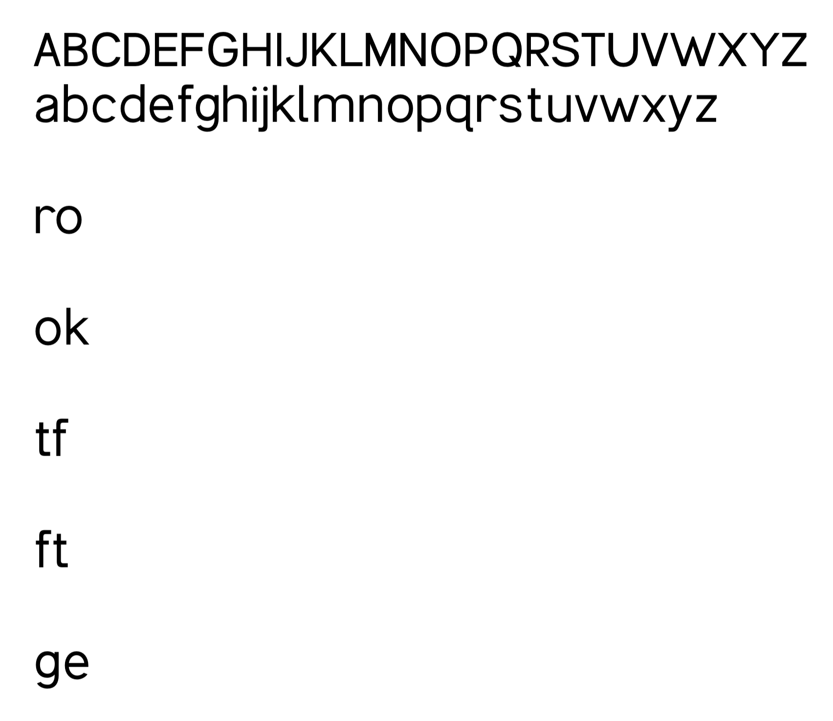
Here you can see some kerning pairs I was specifically targeting having seen them in context.
I’ve also been playing with comparing to some obviously widely used fonts too, so I picked Inter and PP Neue Montreal (my original site sans). You can see stroke thickness is wider for my regular weight, more akin to Inter, but overall the balance feels right.
PP Neue Montreal is spaced tighter on average, but seeing KK Sans in prod caused me to move towards a slightly wider spacing, more closely aligned with Inter and more flexible for tracking adjustments.

More to come!
